10 Beautiful Layouts
Every layout is unique — choose the style that fits your project perfectly.
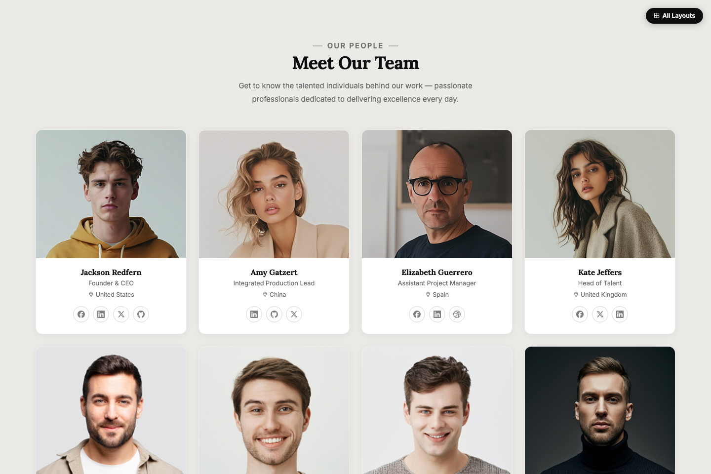
Layout 01
Classic Grid Light
Clean 4-column card grid on a warm neutral background. Ghost social icons, smooth lift-on-hover effect.
Preview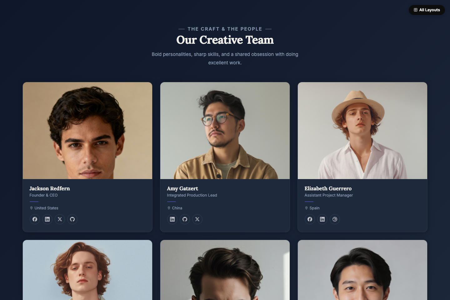
Layout 02
Editorial Dark Grid
3-column landscape cards on a deep navy background. Left-aligned typography with a signature indigo accent rule on each card.
Preview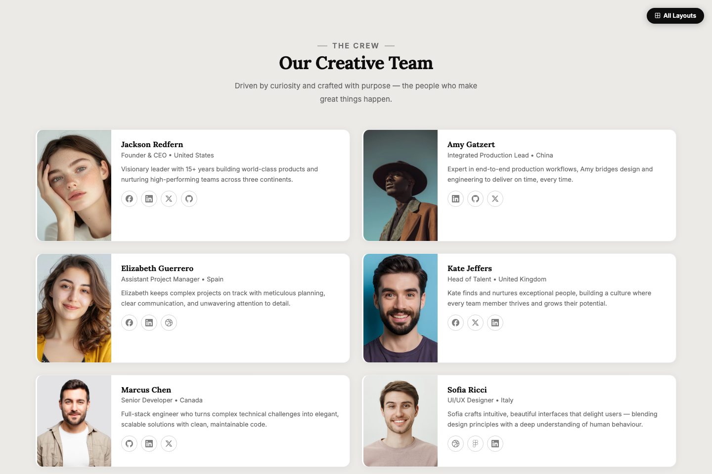
Layout 03
Horizontal Cards
Each member as a full-width row with photo on the left and bio text on the right. Accent border slides in on hover.
Preview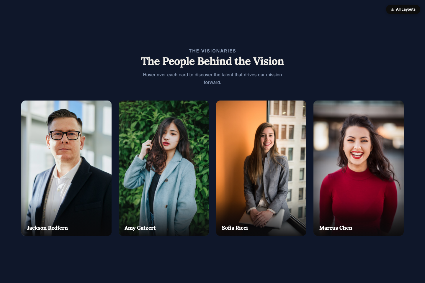
Layout 04
Full Overlay Hover
Portrait cards where hovering reveals name, role, bio, and social links via a dark overlay that slides up.
Preview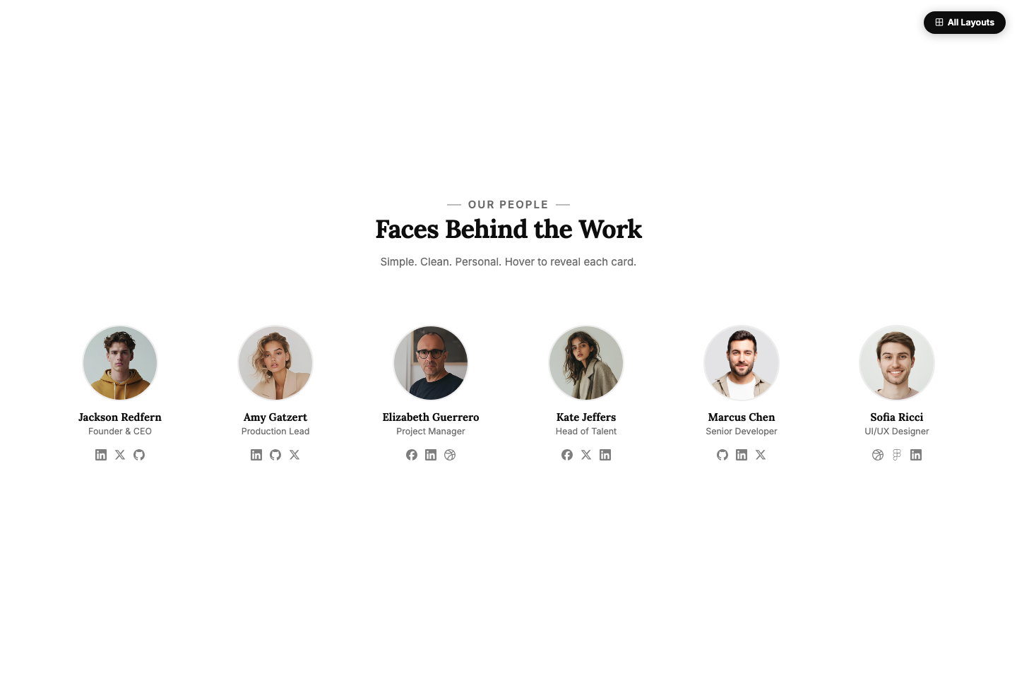
Layout 05
Minimal Circle
Ultra-minimal ghost layout — circular photos, clean typography, and a floating card that materialises on hover.
Preview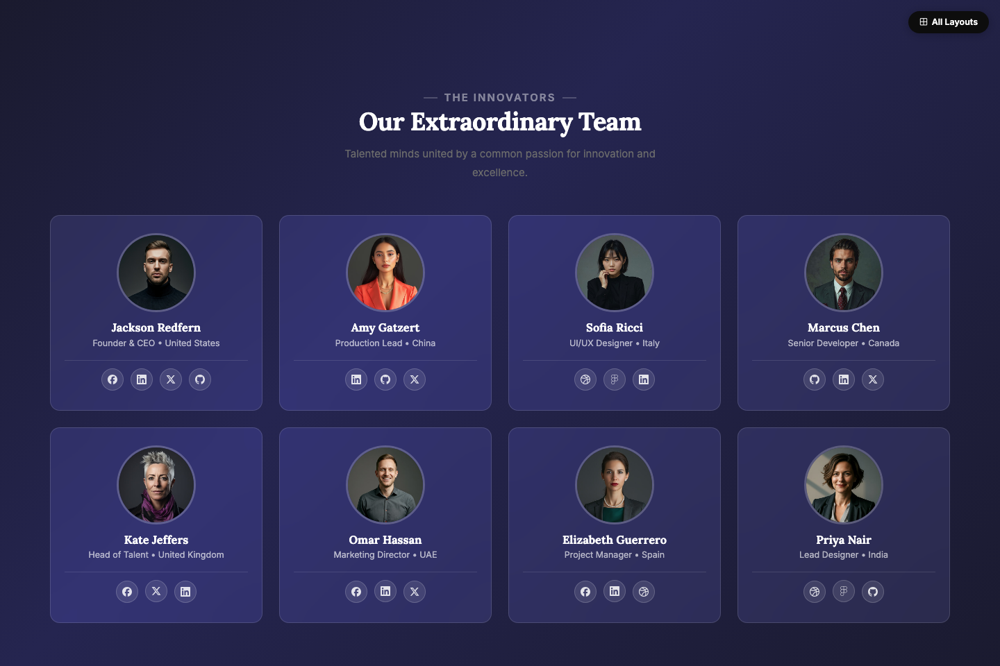
Layout 06
Glassmorphism
Frosted glass cards floating over a vivid purple gradient. Blur + saturation backdrop filter with a graceful fallback.
Preview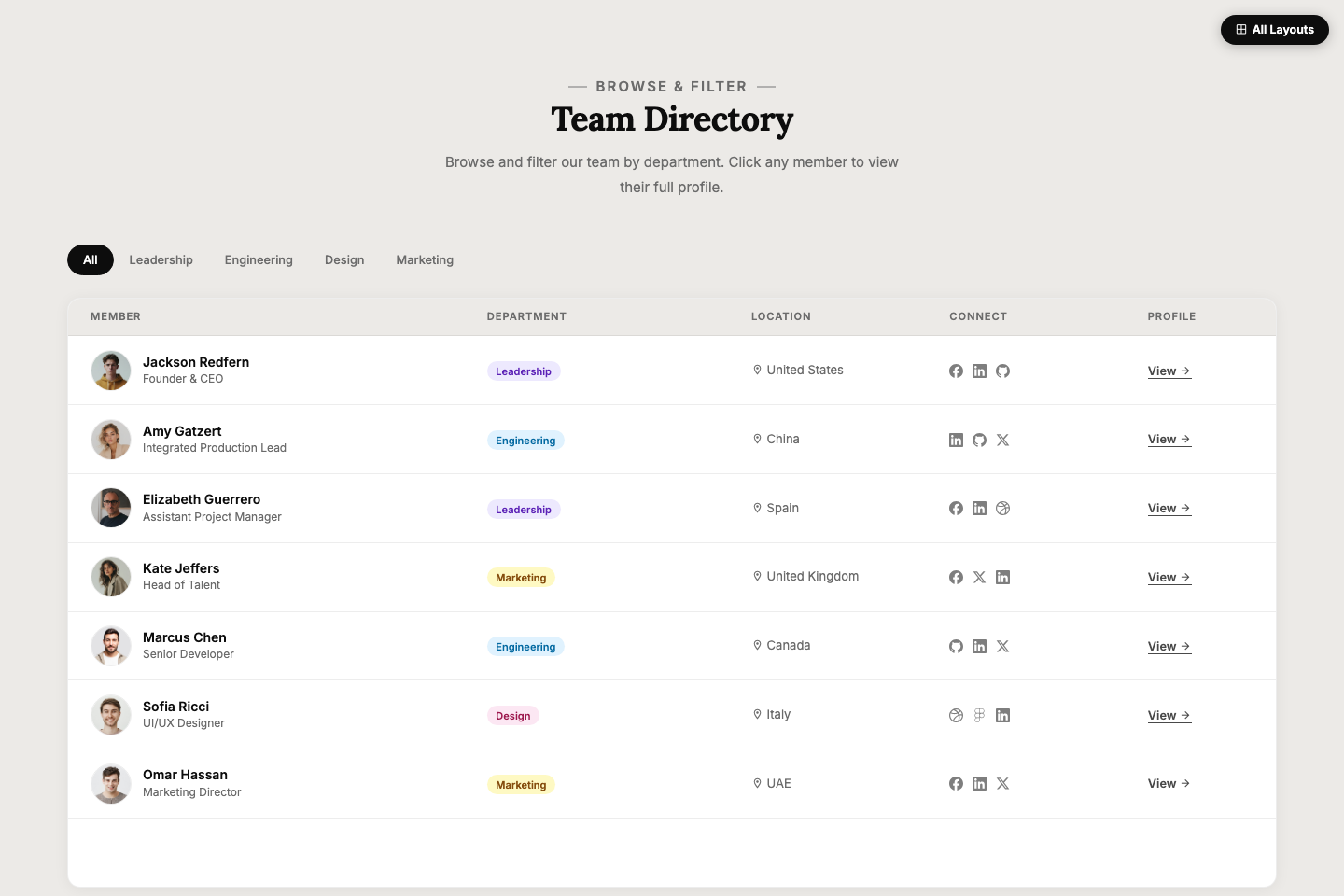
Layout 07
List View
Team directory in a filterable table format. Avatar, name, department badge, socials, and profile link — all in one row.
Preview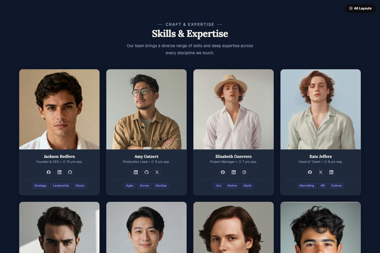
Layout 08
Skills & Tags Dark
Dark mode cards with square-cropped photos. Skill pill badges and experience indicators displayed below each member's social links.
Preview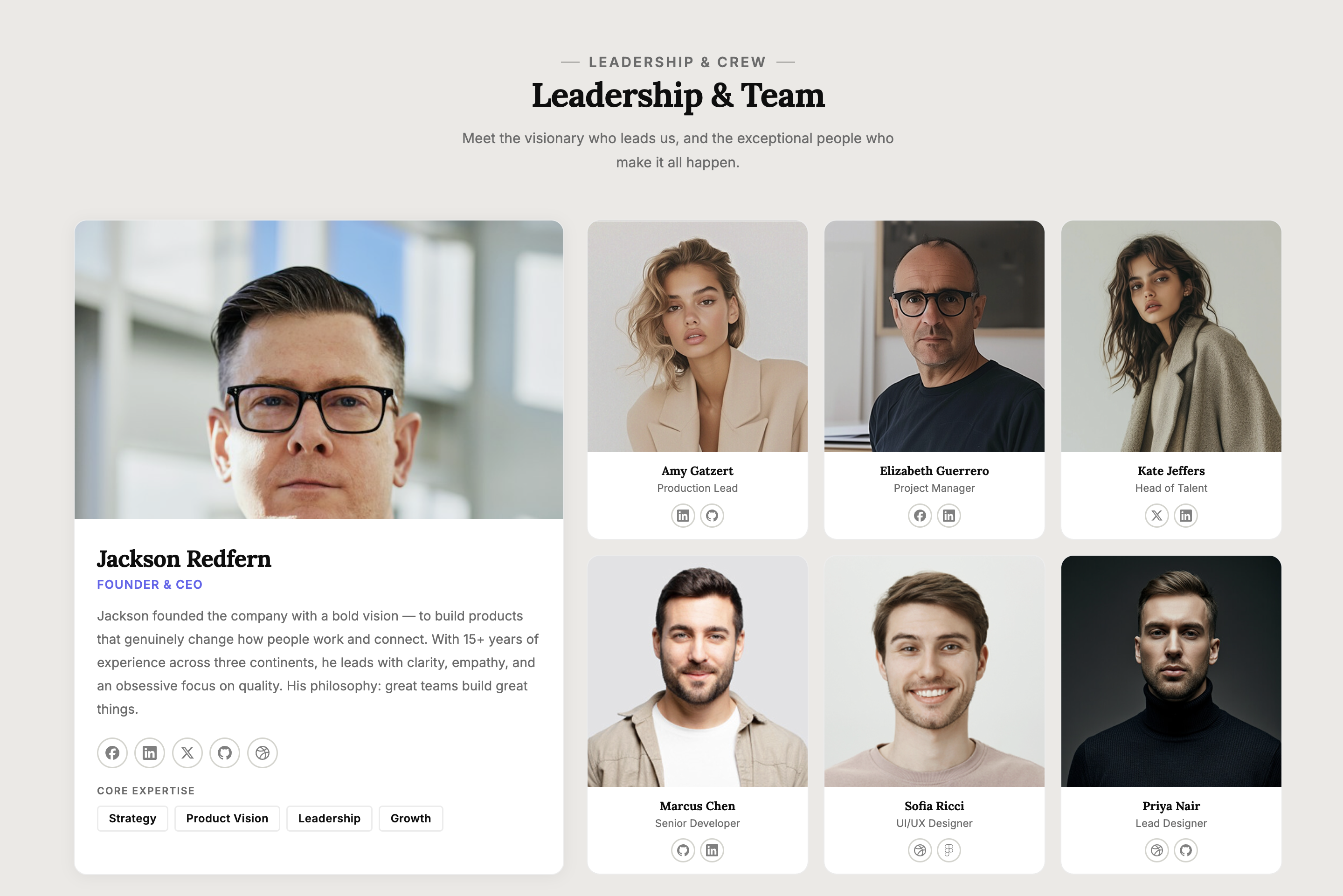
Layout 09
Featured + Grid
Asymmetric layout with a large featured leader card on the left and a compact 3-column mini-grid of the team on the right.
Preview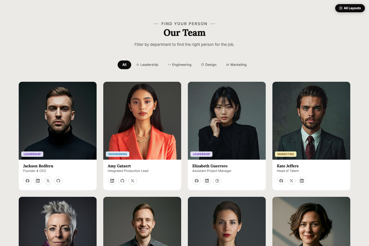
Layout 10
Filter by Department
Square-crop cards with coloured department badges pinned over each photo. Filter tabs instantly show only the department you need.
Preview