TeamDream - Responsive Team Card Bootstrap Template v2.0
Premium HTML Card Template Documentation
Thank you for purchasing Teamdream Responsive Team Card Bootstrap Template.
You can
find the detailed information about the template in this document.
If you have any questions that
are beyond the scope of this help
file,
please feel free to email via the Profile page.
1. Introduction
You are a shining owner of a regular license based on Teamdream Responsive Team Card Bootstrap Template.
We would like to thank you for choosing Teamdream Responsive Team Card Bootstrap Template and
for being our loyal customer.
You are entitled to get free updates to this product + exceptional support (as per market policy) from
the author directly.
We made Teamdream from the ground-up with flexibility in mind.
Each element of Teamdream is extremely customizable, where you can make Teamdream to reflect your own
branding styles.
The guide gives you detailed methodologies about how you can customize Teamdream and make it fit your brand
perfectly!
Please go through the documentation carefully to understand how this product is made and how to edit
this properly.
Basic HTML, CSS, and optional Sass knowledge is recommended to customize.
1.1. What's Included
After purchasing Teamdream template on codecanyon.net with your Envato account, go to your Download page.
Do not directly upload the zip file you downloaded from CodeCanyon. To begin, unzip the CodeCanyon file you
just downloaded which contains the following files:
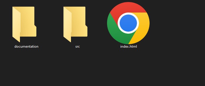
- documentation/ — the file you are reading now.
- src/ — CSS, SCSS, JS, fonts, icons, and team photos.
- src/assets/scss/ — Sass source files used to generate
src/assets/css/style.css. - package.json — optional Sass build scripts for developers. It is not required to use the HTML template.
- landing.html — overview page with links to all 10 demos.
- index.html — Layout 01: Classic Grid Light
- index-2.html — Layout 02: Editorial Dark Grid
- index-3.html — Layout 03: Horizontal Cards
- index-4.html — Layout 04: Full Overlay Hover
- index-5.html — Layout 05: Minimal Circle
- index-6.html — Layout 06: Glassmorphism
- index-7.html — Layout 07: List View
- index-8.html — Layout 08: Skills & Tags Dark
- index-9.html — Layout 09: Featured + Grid
- index-10.html — Layout 10: Filter by Department
Key features:
- 10 Unique Layouts Classic grid, editorial, horizontal, overlay, minimal, glassmorphism, list, skills, featured+grid, and filterable department view.
-
Dark Mode Included
Every layout ships with a CSS custom property theming system — toggle
data-theme="dark"on<html>. - Completely Responsive Optimized for desktop, tablet, and mobile devices via Bootstrap 5.3.
- Interactive Department Filter Vanilla JS filter (no jQuery) with instant card show/hide by department.
- W3C Valid HTML5 All 11 HTML files validated clean with zero errors or warnings.
- Ready Without Build Tools Compiled CSS is included, so you can open any HTML file immediately. Sass source is also included for advanced customization.
Tech stack:
- Bootstrap v5.3.3 (CDN)
- Material Design Icons v7.4 for UI helper icons such as navigation, location, filters, and feature labels
- Google Fonts: Inter + Lora
- Custom SVG social icons (Facebook, LinkedIn, X, GitHub, Dribbble, Figma)
- Sass source files with
!defaultvariables and modular partials - CSS custom properties for theming
- IntersectionObserver card entrance animations
- W3C valid, semantic HTML5
2. Files Structure
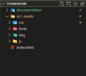
- landing.html — demo overview page.
- index.html to index-10.html — 10 team layout demos.
- src/assets/css/style.css — compiled stylesheet used by all HTML files.
- src/assets/scss/style.scss — main Sass entry file.
- src/assets/scss/_variables.scss — Sass variables and CSS custom properties for colors, fonts, radius, and transitions.
- src/assets/scss/layouts/ — separate partials for each layout style.
- src/assets/js/main.js — dark mode toggle, filter tabs, and card entrance animation.
3. HTML Structure
4. CSS Structure

All HTML files load the compiled stylesheet from src/assets/css/style.css. You
can use the template without Node.js, npm, or Sass because the compiled CSS is already included.
Edit src/assets/css/style.css directly only for small one-off changes. For larger color, font,
spacing, or layout changes, edit the Sass source and rebuild the CSS.
5. Sass Structure
The Sass entry file is src/assets/scss/style.scss. It loads the shared base, social styles,
landing page styles, responsive rules, and each layout partial.
src/assets/scss/
  style.scss
  _variables.scss
  _base.scss
  _layout.scss
  _social.scss
  _landing.scss
  _responsive.scss
  layouts/
    _01-classic.scss
    _02-editorial.scss
    _03-horizontal.scss
    _04-overlay.scss
    _05-minimal.scss
    _06-glass.scss
    _07-list.scss
    _08-skills.scss
    _09-featured.scss
    _10-dept.scss
_variables.scss contains the main Sass variables and CSS custom properties. Layout-specific
styles are separated in src/assets/scss/layouts/ so each demo can be customized without
searching through one large file.
6. Rebuild CSS
package.json is included only for optional Sass customization. It is not required to view or
use the template.
To rebuild the main package CSS from Sass:
npm install
npm run build:css
npm run watch:css
npm run build:css:min
7. Customize Colors & Fonts
For global color and typography changes, start with src/assets/scss/_variables.scss. The most
common variables are:
$td-accent: #6366f1;
$td-radius: 0.875rem;
$td-font-body: 'Inter', sans-serif;
$td-font-heading: 'Lora', serif;
$td-bg-light: #ECEAE7;
$td-card-bg-light: #FFFFFF;
$td-text-light: #0D0D0D;
To change team card colors without rebuilding Sass, you can also edit the CSS custom properties generated
in src/assets/css/style.css:
:root {
  --td-bg: #ECEAE7;
  --td-card-bg: #FFFFFF;
  --td-text-primary: #0D0D0D;
  --td-accent: #6366f1;
}
To change fonts, update the Google Fonts link in each HTML file and then update $td-font-body
and $td-font-heading in Sass, or the compiled font-family values in CSS.
To retheme from another Sass file, configure variables while loading the main entry file:
@use 'style' with (
  $td-accent: #ef4444,
  $td-radius: 0.5rem
);
8. Change Social Icons
Team card social icons are custom SVG files stored in src/assets/img/icons/. Files beginning
with sw- are white icons used on dark or colored surfaces. Files beginning with
so- are brand/color icon variants.
Material Design Icons are still used for general UI helper icons, such as the all-layouts button, location marker, filter tabs, and landing page feature icons.
To change an icon, replace the SVG file or update the image path inside the relevant team card HTML:
<a href="#" aria-label="LinkedIn">
  <img class="td-soc-ic" src="src/assets/img/icons/sw-in.svg" alt="" width="16" height="16">
</a>
Update the href value for the real profile URL and update aria-label when
changing the social network name.
9. Custom Fonts Include

10.1. Change Site Title
To change your Site Title open the index.html in your editor and go to the location by following screenshot which are given bellow.

You can change Site title following this screenshot
11. Modifying HTML Structure
Adding a New Team Card
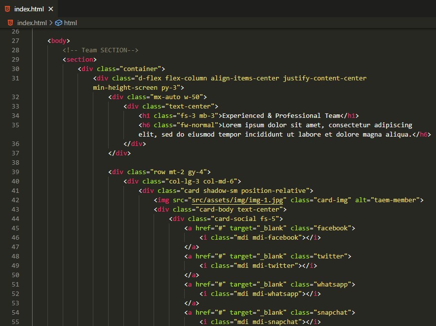
Each layout uses a repeating card block inside a Bootstrap grid row. To add a team member, copy an existing card block and update the content. For Layout 01 (Classic Grid), a card looks like this:
<div class="col-lg-3 col-md-6">
  <div class="td-card">
    <div class="td-card__img">
      <img src="src/assets/img/team/01.jpg" alt="Jane Doe">
    </div>
    <div class="td-card__body">
      <h3 class="td-card__name">Jane Doe</h3>
      <p class="td-card__role">Lead Designer</p>
      <div class="td-card__socials">
        <a href="https://linkedin.com/in/janedoe" aria-label="LinkedIn">
          <img class="td-soc-ic" src="src/assets/img/icons/sw-in.svg" alt="" width="16" height="16">
        </a>
        <a href="https://github.com/janedoe" aria-label="GitHub">
          <img class="td-soc-ic" src="src/assets/img/icons/sw-git.svg" alt="" width="16" height="16">
        </a>
      </div>
    </div>
  </div>
</div>
Removing a Team Card
Delete the entire <div class="col-...">...</div> block for the card you want to
remove. Bootstrap will automatically reflow the remaining cards.
Changing the Number of Columns
Update the Bootstrap column class on each card wrapper. For a 3-column grid use col-lg-4, for
a 2-column grid use col-lg-6:
<!-- 4 columns (default) -->
<div class="col-lg-3 col-md-6">

<!-- 3 columns -->
<div class="col-lg-4 col-md-6">

<!-- 2 columns -->
<div class="col-lg-6">
Adding a Department Filter to Layout 10
Set the data-dept attribute on each card wrapper to match the filter button value:
<!-- Filter button -->
<button class="td-filter-btn" data-filter="marketing">Marketing</button>

<!-- Matching card -->
<div class="col-lg-3 col-md-6" data-dept="marketing">
  ...
</div>
12. Deploying to a Live Server
What to Upload
Upload the contents of the main package folder (not the outer CodeCanyon zip). Your server root should contain:
landing.html
index.html
index-2.html  ...  index-10.html
src/
documentation/
Option A — Traditional Web Hosting (FTP/SFTP)
Connect to your hosting account with an FTP client (FileZilla, Cyberduck, etc.) and upload all files and
folders to your public root directory (usually public_html/ or www/). Make sure to
preserve the folder structure exactly.
Option B — Netlify (Free, Drag & Drop)
- Go to netlify.com and sign in (or create a free account).
- Open the Sites tab and drag your project folder into the drop zone.
- Netlify instantly deploys and gives you a live URL. You can connect a custom domain in Site Settings.
Option C — GitHub Pages
- Create a new public repository on GitHub and push all project files to the
mainbranch. - Go to Settings → Pages, set the source to the
mainbranch and/ (root). - Your site will be live at
https://<username>.github.io/<repo>/.
Notes
- No server-side language (PHP, Node.js) is required — this is a pure HTML/CSS/JS template.
- Bootstrap 5.3 loads from CDN. Make sure the deployed server has internet access, or download Bootstrap
locally and update the
<link>tag in each HTML file. - Google Fonts also loads from CDN. For offline or intranet use, download the fonts and host them locally.
13. Troubleshooting & FAQ
The page looks unstyled when I open the HTML file directly
Some browsers block CDN resources when opening a file via file:// (no web server). Use a local
web server instead:
# With VS Code: install the "Live Server" extension and click "Go Live"
# With Node.js:
npx serve .
# With Python 3:
python -m http.server 8080
Icons are not showing
Check that the src/assets/fonts/ folder was uploaded along with the
src/assets/css/ folder. The Material Design Icons webfont is loaded via a relative path from
the CSS file. If fonts are missing the icons render as empty squares.
Dark mode does not toggle
The dark mode toggle button calls main.js. Make sure src/assets/js/main.js is
loaded in your page and there are no JavaScript errors in the browser console. Open DevTools (F12) → Console
to check.
Department filter (Layout 10) does not work
Confirm that each card wrapper has a data-dept attribute and each filter button has a matching
data-filter attribute. Values are case-sensitive. If you added a new department, add both the
button and the attribute.
Cards are not animating on scroll
Card entrance animations use the IntersectionObserver API, which is supported in all modern
browsers. If you are testing via file:// in Firefox, some security policies can block it — use
a local server as described above.
I rebuilt the CSS from Sass but the layout broke
Run npm run build:css from the project root (not from inside src/). Verify that
Node.js 14+ and the sass package are installed (npm install). The output file must
be saved to src/assets/css/style.css.
Glassmorphism (Layout 06) looks plain in some browsers
The frosted glass effect requires backdrop-filter: blur(), which is not supported in Firefox
by default (it can be enabled in about:config). The template includes a graceful fallback via
@supports so the layout still looks clean without the blur effect.
Can I use this template in multiple client projects?
A Regular License covers one end product (one domain). For multiple client sites you need a separate Regular License per project, or an Extended License. See the Envato License Terms for full details.
14. Sources and Credits
The product uses following resources by third parties.
- Bootstrap v5.3.3
- Google Font Lora
- UI Icons Material Design Icons v7.4
-
Social Icons
Custom SVG icons included in
src/assets/img/icons/ - Images Pixabay
15. Support
Support Scope
Please be reminded that you have purchased a very affordable product and you have not paid for a full-time web design agency. Occasionally, we will help with small tweaks, but these requests will be put on a lower priority due to their nature.
Included in Free Support Scope:
- Fixing bugs
- Helping clients in changing site contents by sending instructions that couldn’t be covered by documentation
NOT Included in Free Support Scope:
- Any type of custom changes
- Any type of request to update clients’ site contents
Paid Support Scope:
Paid support is not a part of Free Support when you purchase the template from themeforest. We understand that some clients need custom changes while using our template. For that we kept an option for paid support which includes:
- Custom change request
- Custom pages
- Custom features
We kept a flat rate for our paid support which is $35/hour.
Before seeking support, please...
- Make sure your question is a valid item issue and not a customization request.
- Make sure you have read through the documentation or any related video guides before asking support on how to accomplish a task.
16. Regular Updates
We’re always improving our skills and knowledge so we’re making changes regularly. From bug fixes to new awesome features, updates generally come at least twice a month.
  V. 2.0.1 – 2026-06-29
  - Item title updated to correct Envato format: Teamdream | Responsive Team Card Bootstrap Template
  - Review solicitation text and imagery removed from item description (Envato policy)
  - Tags reduced to 13 unique, relevant items; near-duplicates removed
  - Replaced minified materialdesignicons.css with full unminified source (MDI v7.4.47)
  - Vendor directory removed from documentation/js/; jQuery loaded from CDN
  - Documentation expanded: HTML structure modification examples,
    live server deployment guide (FTP, Netlify, GitHub Pages),
    Troubleshooting & FAQ section (8 common issues)
  - Package cleaned: removed all .DS_Store files and __MACOSX artifacts

  V. 2.0.0 – 2026-06-19
  - Full visual redesign: warm neutral palette, dark mode overhaul
  - 10 unique layouts (was 1): Classic Grid Light/Dark, Editorial Dark,
    Horizontal, Overlay, Minimal Circle, Glassmorphism, List, Skills+Tags,
    Featured+Grid, Filter by Department
  - SVG social icons replacing MDI icon fonts for brand marks
  - Twitter renamed to X throughout (icon + aria-label)
  - IntersectionObserver card entrance animations
  - Interactive department filter with Vanilla JS
  - Inter + Lora Google Fonts pairing
  - Sass source files added with modular layout partials and build scripts
  - W3C validated — zero errors across all 11 HTML files

  V. 1.0.0 – 2024-03-01
  - Initial release
17. Thanks
Once again thank you for purchasing one of our Templates.